THE BRIEF
THE APPROACH
THE RESULTS
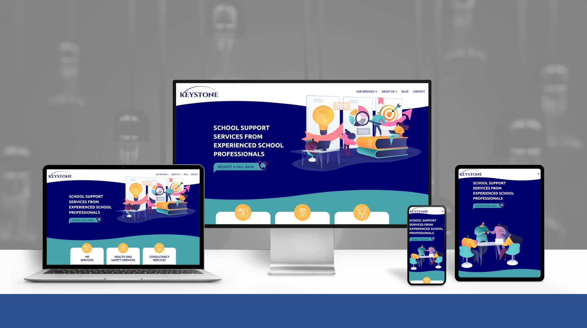
A clear and easy to navigate website, with a consistent look and feel throughout, using a range of illustrations and images to enhance the aesthetic.
NB: A second revision of this design was created by us in September 2022, to reflect the changes to the business as it developed over the year - find out more here.I was looking for a new website when I saw a LinkedIn post by Chris. I was struck by his approach to building sites, and the customer centric nature of what he is doing, without following fads. My previous site was an awful mess of a DIY WordPress site and I needed to up my game.
Chris took our design brief and delivered on it, on time and in budget. The development process was quick, and he totally ‘got’ the ethos of how we work and we wanted that in our site.
Since going live, the support has been great when we’ve needed it, and it’s a doddle to keep updated. So impressed were we that I had an additional site done too for SchoolMark, which required not only the traditional site, but a portal for customers to log onto to engage with us as well. Likewise, this was delivered when promised, and I’m a happy site owner!

