THE BRIEF
THE APPROACH
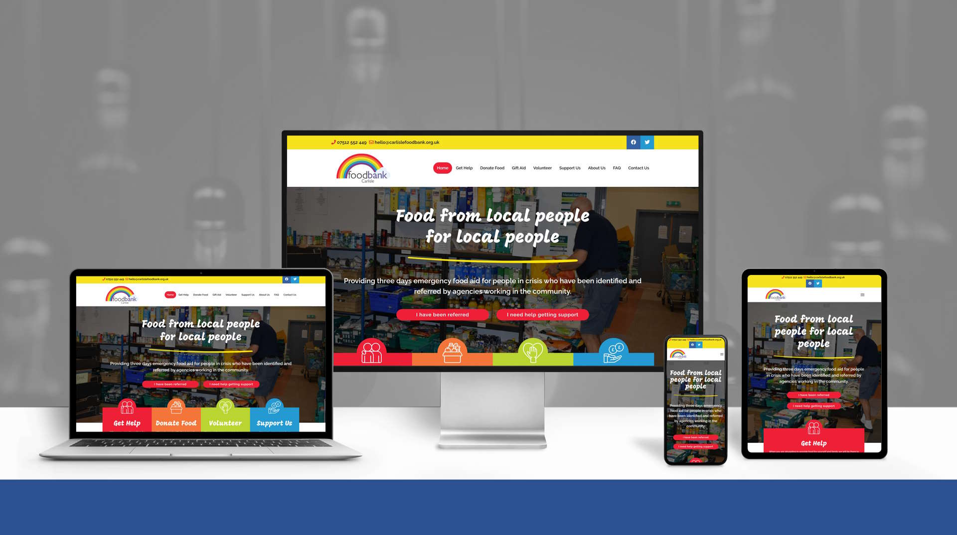
We worked with Lisa from Pepperdog Design to create a set of page designs which brought together a strong, clear, hero section at the top of the home page so that visitors can instantly tell what they charity offers.
The rest of the home page introduces more about the charity, and provides clear navigation points to key areas of the website where people can find out how to get help, or provide support to those in need.
THE RESULTS
With a strong and consistent visual style throughout the website, and integration of several new features such as an interactive Google Map of foodbank locations, the final website also allows for visitors to complete a Gift Aid form online, and ensures the charity is in a stronger position to attract more donations and support.
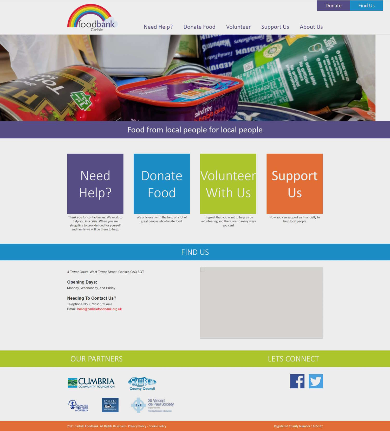
A screenshot of the original website:


