THE CHALLENGE
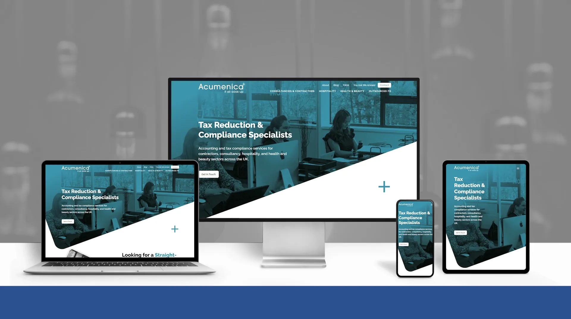
Alan from Acumenica knew LinkedIn was driving leads - but his website wasn’t pulling its weight. He needed a digital presence that spoke directly to his ideal clients, showcased the firm’s personality, and turned visitors into paying clients. The mission? A full refresh of design and content that felt sharp, professional, and conversion-focused.
OUR APPROACH
We started with strategy: Alan’s guidance helped us nail the navigation and homepage flow to guide users through a clear journey. Then came the words - Hannah Gibson crafted copy that was warm, confident, and built to convert. With content locked in, Lisa from PepperDog Design brought it to life with a sleek, modern aesthetic that reflected Acumenica’s credibility and approachability.
We didn’t stop at looks:
- SEO-friendly structure to boost visibility
- Smart UX that speaks to target client types
- Seamless migration of blog and YAWA content, now searchable
- A custom quote tool that gives users instant pricing insights - no emails required
THE RESULTS
The new Acumenica site is a powerhouse - visually polished, strategically structured, and built for performance. It’s now a true extension of the business, helping visitors find answers fast and take action even faster.
Photography
Client Country
I love Chris's approach to web design. Made a great job of www.acumenica.co.uk. He listened to what we thought we needed, told us what we actually needed, implemented and executed. Great lad, great business.

